
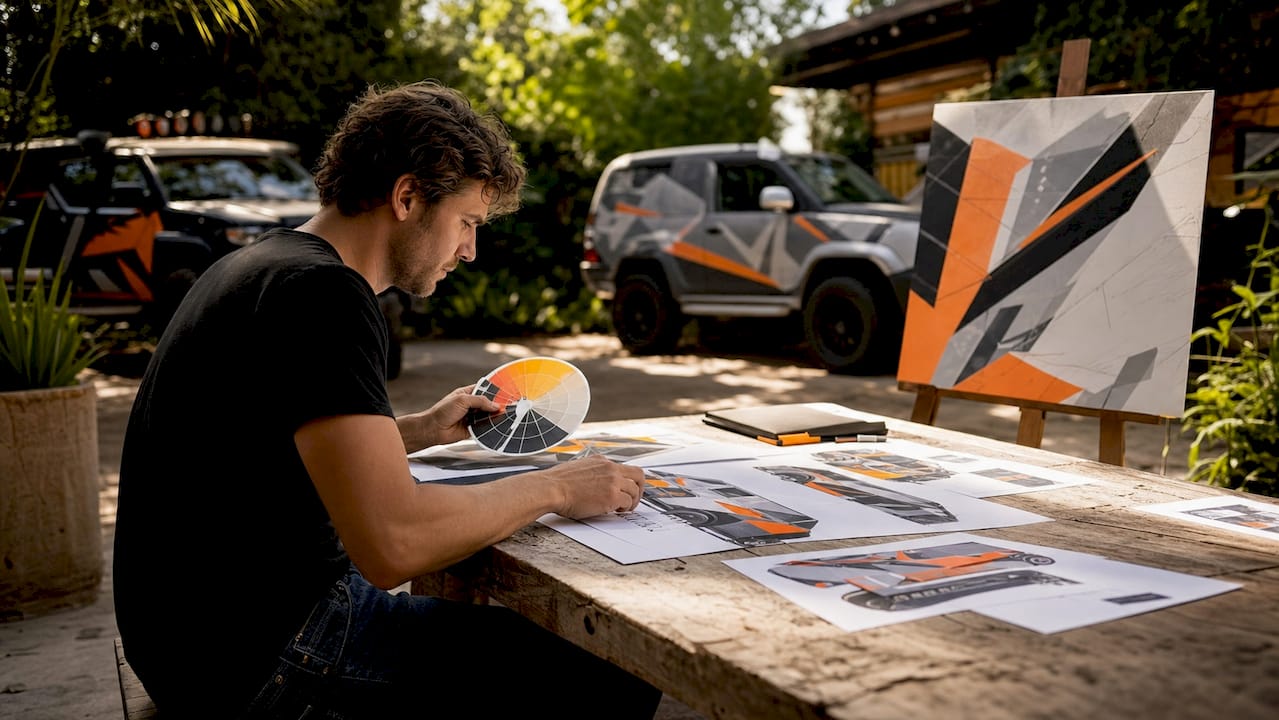
The strongest vehicle wrap color scheme examples share one trait: they prioritize readability over everything else. Color acts as a cognitive anchor for brand recognition at highway speeds, so a palette that looks great in a design file but falls apart on a moving van is a wasted investment. For commercial fleets, the right combination of contrast, psychology, and consistency turns every vehicle into a mobile billboard that builds recall block by block.
Key elements of an effective fleet wrap color scheme:
- High contrast pairings like white on dark blue or black on yellow maximize legibility at distance and speed
- Color psychology alignment with your industry (red for food service, blue for healthcare, yellow for construction)
- Consistent palettes and logo placement across every vehicle in the fleet
- Finish selection (gloss, matte, or satin) matched to your brand’s visual tone
- Premium materials from partners like 3M and Avery Dennison for color accuracy and durability
Table of Contents
- Common mistakes that kill fleet wrap effectiveness
- Proven vehicle wrap color scheme examples by industry
- Why color consistency across your fleet builds real brand power
- Njvinylwrapz delivers fleet color consistency that actually holds
- FAQ
- Key Takeaways
Common mistakes that kill fleet wrap effectiveness
Most fleet branding problems trace back to a handful of avoidable decisions made early in the design process.
- Low contrast color choices. Light blue text on a white van, or dark purple on black, disappears when seen at speed. Contrast is not a design preference; it is a functional requirement.
- Inconsistent colors across vehicles. When truck three uses a slightly different shade of navy than truck one, the fleet-wide brand recall breaks down. Consumers build mental shortcuts from repetition, and fragmentation erases them.
- Ignoring vehicle surface features. Rivets, door handles, and panel seams distort graphics. Placing your logo over a door hinge is one of the most common and costly errors.
- Non-uniform logo placement. A logo centered on one van and pushed to the rear quarter panel on another reads as two different companies.
- Skipping a vinyl proof. Color shifts between screen and printed vinyl are real. CMYK proofing on actual substrate before a full fleet run catches discrepancies before they multiply.
Proven vehicle wrap color scheme examples by industry
Pro Tip: Place your core logo and primary message on the flattest panel surface available. Reserve complex vehicle sections for secondary colors or solid fills.
Food and beverage fleets
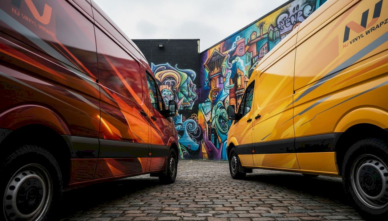
Red, yellow, and orange are the proven palette for food service vehicles. Red triggers urgency and appetite, yellow radiates warmth, and together they create instant recognition. Pair them with white or black text for legibility. A white panel base with a bold red logo and yellow accent stripe is one of the most field-tested color schemes for delivery and catering fleets.
Healthcare and medical transport
Blue and white dominate this sector for good reason. Blue conveys trust and professionalism, white signals cleanliness, and together they communicate credibility before a patient reads a single word. Softer mid-blues outperform dark navy in community settings because they feel approachable rather than institutional. Green works well as a secondary accent for wellness brands.
Construction and trade services
Yellow, orange, and black mirror the safety signage already embedded in job-site culture, so recognition is almost automatic. A black base with high-visibility yellow lettering reads clearly in residential neighborhoods and active work zones. Bold, saturated tones consistently outperform pastels in this sector. For HVAC, plumbing, and electrical fleets, one dominant warm color applied consistently across the fleet builds neighborhood-level recall faster than any complex design.
Technology and professional services
Blue, black, and white with selective accent colors define the tech palette. Electric green, cyan, or violet accents differentiate without overwhelming the core scheme. Gloss finishes maximize color vibrancy at distance, while matte finishes project a modern, understated look that suits premium service brands. Satin sits between the two and works well for consulting or financial services firms that want polish without flash.
Finish effects on color perception
Gloss makes colors appear more saturated and eye-catching on moving vehicles. Matte reduces glare and suits brands projecting sophistication. Satin offers a subtle sheen without harsh reflections. Dark colors on sun-exposed trailers absorb more heat, which accelerates vinyl degradation per 3M product documentation, so balancing dark areas with lighter panels and UV-protective laminates extends wrap life significantly. For automotive-inspired color combinations, pairing a matte base with gloss or metallic accents creates visual depth without sacrificing readability.
Why color consistency across your fleet builds real brand power
Uniform color application is not a design nicety. It is the mechanism by which your fleet becomes recognizable. Experienced fleet managers consistently point to standardized logo positioning and color application as the primary driver of neighborhood-level brand recall.
Fragmentation in fleet wrap color schemes and layouts threatens brand legitimacy. Only consistent palettes and logo placement produce the mental shortcut that turns a passing vehicle into instant brand recognition.
The table below shows how consistency variables affect fleet branding outcomes.
| Variable | Consistent fleet | Inconsistent fleet |
|---|---|---|
| Logo placement | Same position on every vehicle | Varies by vehicle model |
| Color accuracy | Standardized CMYK profiles | Varies by print run |
| Brand recall | Builds with each sighting | Resets with each variation |
| Consumer trust | Reinforced | Undermined |
Njvinylwrapz uses centralized production and documented CMYK color profiles to maintain color uniformity across every vehicle in a fleet, regardless of vehicle model or wrap date.
Njvinylwrapz delivers fleet color consistency that actually holds
Fleet managers who have wrestled with mismatched wraps across a growing vehicle roster know the problem well. Njvinylwrapz offers a direct solution: over 10 years of professional experience, licensed and insured operations, and material partnerships with 3M and Avery Dennison that guarantee color accuracy from the first van to the fiftieth.
Every project runs through climate-controlled installation facilities, which eliminates the adhesion failures and bubbling that plague wraps installed in uncontrolled environments. From custom design through printing and installation, the process is end-to-end. You get a fleet that looks like one brand, not a collection of close-enough approximations. Request a consultation for your full vehicle wrap project and see what consistent fleet branding actually looks like at scale.
FAQ
What color combinations are most readable on moving vehicles?
Black on yellow and white on dark blue are among the most visible pairings at distance and speed, according to Mega LED Technology signage research.
How do I keep colors consistent across a large fleet?
Build all design files in CMYK color space from the start and request a printed proof on actual vinyl substrate before a full fleet run. Centralized production with documented color profiles prevents drift between vehicles.
What finish works best for commercial fleet wraps?
Gloss finishes maximize color vibrancy and visibility at distance, making them the default for most commercial fleets. Matte and satin suit premium or professional service brands where a more understated look fits the brand identity.
Can Njvinylwrapz match colors across different vehicle models?
Yes. Njvinylwrapz uses standardized CMYK profiles and climate-controlled facilities to maintain color accuracy across different vehicle types and wrap dates.
Key Takeaways
The most effective fleet wrap color schemes combine high-contrast pairings, industry-aligned color psychology, and consistent application across every vehicle to build durable brand recognition.
| Point | Details |
|---|---|
| Contrast drives readability | Black on yellow and white on dark blue are the most legible pairings at highway speeds. |
| Color psychology by industry | Red and yellow for food service, blue and white for healthcare, yellow and black for construction. |
| Finish affects perception | Gloss maximizes vibrancy; matte projects sophistication; satin suits premium brands. |
| Consistency builds recall | Standardized CMYK profiles and uniform logo placement across every vehicle are what create fleet-wide brand recognition. |
| Njvinylwrapz for fleet branding | Over 10 years of experience, 3M and Avery Dennison partnerships, and climate-controlled installation deliver color accuracy at fleet scale. |